How you can easily create a Responsive navigation bar?
Table of Contents
Hi Folks, here we are presenting 15+ responsive navigation bars with free code. All the examples you can check live with the play button. I am 100% sure after reading this article you will learn and create your own navigation bar.
Today we are going to show you more than 30 examples of responsive navigation, In this example of the responsive navbar, we will cover how you can make a navbar using HTML, CSS, JS.
If you are creating a website then the navigation bar is most important when it comes to user experience. The navigation bar decides the user flow.
If you find any help related web design, front end development, social media engagement Contact us
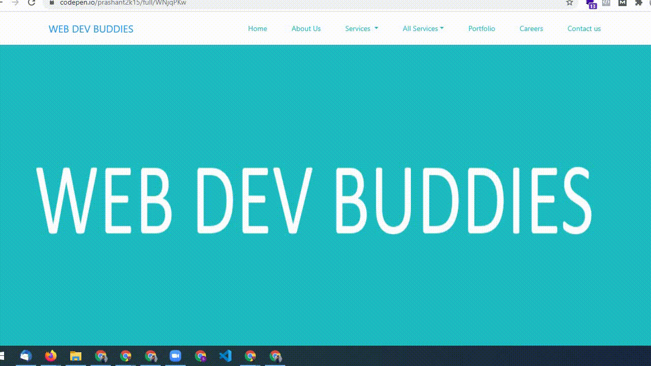
Example 1: How we can create a responsive navigation menu using pure HTML, CSS and JS?
This example navigation bar looks good on any screen size. Their is no framework used in the example. This pen is created by Our Senior Developer Prashant.
If you find any problem with loading you can leave a message for us or Directly download the code from Github
See the Pen Responsive Simple Navigation Menu by Prashant Nayak (@prashant2k15) on CodePen.
Examples 2: How we can create a responsive navigation menu using Bootstrap?
In this example, we will see how Iavn grozdic has created a navigation menu using bootstrap 4.
You can also learn how you can change the background color with a button click. Is it cool?
Click the play button on the pen.
See the Pen Responsive Bootstrap 4 menu – light/dark by Ivan Grozdic (@ig_design) on CodePen.
Examples 3: How we can create a responsive navigation Mega menu bar using Bootstrap 4?
In this example, we will see how our developer Prashant Nayak has created a Responsive navigation bar menu using bootstrap 4.
See the Pen Mega Menu by Prashant Nayak (@prashant2k15) on CodePen.
Examples 4: Mega+Normal navigation bar menu using Bootstrap 3
In this example, we will see how redfrost has created a responsive navigation bar menu using bootstrap 3.
This looks really simple, neat and clean.
See the Pen Bootstrap 3 Mega menu with CSS by redfrost (@redfrost) on CodePen.
Examples 5: Sidebar responsive navigation bar using Bootstrap 3
In this example, we will see the left side navigation menu using bootstrap 3. This is really unique the opening and closing animation is awesome and professional.
Here is a codepen example. Please check it out. If you find any problem with codepen preview you can always visit this Github link.
See the Pen Pure CSS3 Parallax Menu by Bryce Snyder (@brycesnyder) on CodePen.
Examples 6: How to create a simple hamburger menu bar using CSS only?
See the Pen simple hamburger menu by BrainUP (@jpag82) on CodePen.
Examples 7: Navbar Smooth Transition on Scroll PUG, Stylus, Babel
In this example, we can see the sticky header bar with smooth transition in height and padding. This cool navbar menu makes website cool. This navbar header menu is designed by Simon Vrachliotis.
Here is codepen preview if you find any issue in preview, you can always visit Github link
See the Pen Navbar Transition on Scroll by Simon Vrachliotis (@simonswiss) on CodePen.
Example 8: How to create sidebar nav-off menu with basic animation using html and CSS only?
This is a UI,UX improvements with only CSS and code is written really neat and clean and looks good on any screen size. This pen is created by Twikito.
If you find any problem with loading you can leave a message for us or visit GitHub for code.
See the Pen UI with UX improvements with only CSS by Twikito (@Twikito) on CodePen.
Example 9: How to create Hamburger Responsive navigation bar To Fullscreen view from the left corner to bottom right?
This is Burger menu transformation. The code is written in HTML and SCSS only. This pen is created by Victor Belozyorov and its is amazing fast because there is no extra library.
If you find any problem with loading you can leave a message for us or visit GitHub for code.
See the Pen Burger menu transformation by Victor Belozyorov (@WispProxy) on CodePen.
Example 10: How to create a Responsive navigation bar using Full CSS / No JS?
Here is a great example of Burger Menu using <nav></nav> which is a great example of creating a Burger menu with plain HTML and CSS. This pen is designed by Julien Lejeune.
If you find any problem with the Responsive navigation bar loading you can leave a message for us or visit GitHub for code.
See the Pen Burger Menu – Full CSS / No JS by Julien Lejeune (@jlnljn) on CodePen.
Example 11: How to create Fancy Menu – Full CSS / No JS?
In this example, let see how we can create a fancy responsive navigation bar with really cool animation on a hover snippet.
This fancy Navbar menu is great when you are designing your portfolio page.
This pen is designed by Blaz Kemperle
If you find any problem with loading you can leave a message for us or visit GitHub for code.
See the Pen Fancy menu by Blaz Kemperle (@blazicke) on CodePen.
Example 12: How to create Pure CSS Slide Out Menu?
In this example, we will see how we can create a Pure CSS Slide Out Menu from the sticky right side.
This pen is designed by Max Kurapov
This slide-out Responsive navigation bar is better with mobile, tab and Desktop.
If you find any problem with loading you can leave a message for us or visit GitHub for code.
See the Pen Pure CSS Slide Out Menu by Max Kurapov (@mkurapov) on CodePen.
Example 13: How to create E-Commerce Navigation Bar with the Product name and category?
If you want a menu for your e-commerce project/ Blog Project you can use this navigation bar which is perfectly crafted by Olivia Ng. Preview this pen and you will love to see the way it’s working
Find the code here Github link
See the Pen E-Commerce Navigation Bar by Olivia Ng (@oliviale) on CodePen.
Example 14: How to create A simple Dropdown Menu center align?
In this example, we will see how we can create a center align simple menu with drop and down. This is crafted by Mike Rojas.
See the Pen A simple Dropdown Menu by Mike Rojas (@mikerojas87) on CodePen.
Example 16: How to create Responsive Off-Screen Navigation Menu using jQuery Plugin?
Effective Responsive navigation bar patterns are so hard to find nowadays. There are so many of them. They look promising, but a lot of the time when you get into actually beginning to use one, it bites you in the behind.
Caroline has created a nice jQuery plugin for the mega menu which is equally good at mobile and desktop. We have only seen this type of menu in the premium version of the ThemeForest menu plugin.
We have given this menu a 10-star rating because we love the way it works. The structure is neat is clean
Code markup is written in a nice way.
Look at the preview pen. Visit the Github link
See the Pen Responsive Navigation Menu jQuery Plugin by Caroline (@charlie2646) on CodePen.
Wrap it up then
We have tried our best to make you understand about navigation menu. Now we guarantee you can make your own responsive navigation bar.
Comment below if you find any difficulties in creating a navigation menu bar if you are a newbie We suggest use CSS frameworks like Bootstrap, tailwind, Bulma etc.
You can always contact us for web design, front end development, social media engagement

 Call (+91) 920-602-0591
 info@webdevbuddies.com
 Enquiry Form